Perhaps being born and raised in a place that has always been called “the cradle of civilisation” – the land that gave the world the very first alphabet – has been my main source of inspiration. I adore my native tongue – Arabic. What’s more, I am very interested in the various ways it is used in the advertising industry. Finding the best possible way to present this language in an advert has always been one of my major interests, especially nowadays, where, for instance, all advertising campaigns in the Arab world are first written in English and then translated into Arabic. In many cases, this process distorts the beauty of the words and sometimes the main idea gets lost in translation.
Working in the advertising industry, I always strive to present Arabic in the best way possible. Experience and enthusiasm was the reason I got involved in ‘Arabisation’ in advertising. I believe I have been through all the difficulties, problems, and misunderstandings that may occur in this process (Arabic fonts, Arabic software, Arabic operating systems, right-to-left layouts, translations, compatibility, file formats, concepts, cultural translation, logo adaptations, calligraphy, pre-printing and printing process, etc.).
My experience lies in having been involved in many multilingual ad campaigns, and in the whole process – from brainstorming to the final product. A strong Arabic background supported by fluency in English, both play a major role with technical software experience and Arabic compatibility. Put simply: always try to reduce the gap between Arabic and English.
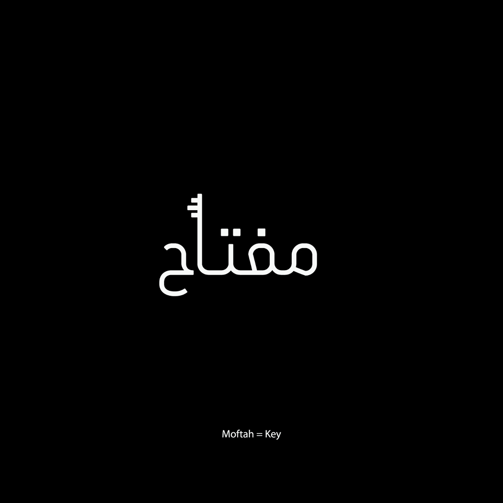
My project, “Written Visual,” is all about giving the word a shape. The project presents a range of Arabic words used daily, shaped according to their meanings. Regardless of the way they were written, dialects have developed throughout the years making communication much easier. This project tries to add a third dimension; a visual aspect to the written words in order to make them visually meaningful.
The idea for “Written Visual” was born about a year ago. I had thought about it for a while before I started working on it, and then, I showed the ideas to my colleague Abir Fawaz – a talented designer with a strong interest in typography – she was excited to join me and be part of the project. Together we were able to accomplish the project the way it is presented now. Since this experiment is about visual communication, some shapes or words might convey the meaning better than others and this is what urges us to try harder to create new and comprehensible shapes.
We tried to choose simple and common words because some people may find some words confusing due to the different dialects we have in the region…on top of the challenge of making the idea within the drawings plain and simple! This collection is only the beginning of what we hope will be a vast collection that continues to grow.
http://www.kalimatmagazine.com/artdesign/13839168/


